Birch & boar Butchery
Spruce City Elixirs
ROTORFLAKE
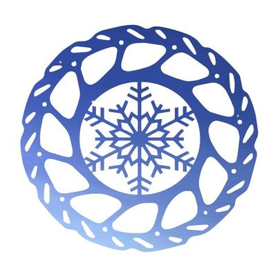
This logo has been used on all my personal branding material since its creation in 2015. It all started (of course) with skiing and biking.
I was fixing up my bike (a common theme when riding a 2006 Transition Covert in 2017 on the North Shore) and while replacing the rear chainset, I kept some of the smaller chainrings for arts and crafts sake. It must've been around Christmas because I also had a little snowflake ornament sitting on the work bench too. I decided to see what they would look like together if I were to create some sort of review mirror art for my car...and they fit perfectly! The little plastic snowflake fit snugly in the centre of the chainring so I glued it in place, attached a tiny carabiner and it's been hanging in my car ever since.
This little ornament worked so perfectly, I knew it was meant for something more. After playing around with a graphic design version, I came up with "RotorFlake". I traced one of many bent brake rotors from my trusty steed, scanned it into Illustrator and sketched a snowflake in the centre. To add a bit of colour, I've placed the sky from my Thunderdome painting in the background. The result is a design that reflects my passion for the mountains through skiing, biking and art.
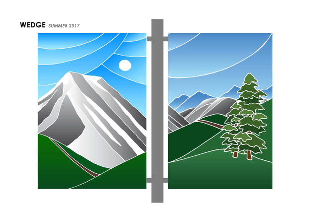
WHISTLER BANNER DESIGNS - SPRING/SUMMER
|
|
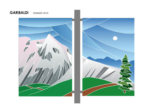
The municipality of Whistler issued a call for artist submissions to design their summer banner series for 2017 last spring. I jumped at the chance since I love brightening up city streets with a bit of art...especially mountain art! These designs honor two very special peaks in the Sea to Sky region; Wedge and Garibaldi mountains. Both are distinctly recognizable in the Whistler area, and I wanted to design something that visitors and locals alike could relate to.
The connecting theme with my designs is an alpine pathway that winds its way through each of the banner designs. We travel through the seasons as we do the mountains, each constantly changing as we adapt. As we go forward with each passing season we learn from the old and grow with the new in an ever-evolving experience.
The connecting theme with my designs is an alpine pathway that winds its way through each of the banner designs. We travel through the seasons as we do the mountains, each constantly changing as we adapt. As we go forward with each passing season we learn from the old and grow with the new in an ever-evolving experience.
RIPPLE COAST LOGO DESIGN
Ripple Coast is an incredible organization created to inspire environmental stewardship and conservation through meaningful experiences with nature. They host programs, workshops and trips along our wild BC Coast to introduce our precious landscape to students that would otherwise not have the opportunity.
Maureen Cho, the Founder and Executive Director of Ripple Coast contacted me to design a logo for her new organization and I was thrilled at the opportunity! I created this design in close collaboration with Maureen to signify the 'ripple effect' the natural world has on its surroundings...including us.
Maureen Cho, the Founder and Executive Director of Ripple Coast contacted me to design a logo for her new organization and I was thrilled at the opportunity! I created this design in close collaboration with Maureen to signify the 'ripple effect' the natural world has on its surroundings...including us.
G3 SKI TOPSHEET DESIGN CONTEST - "ABSTRACT TERRAIN"
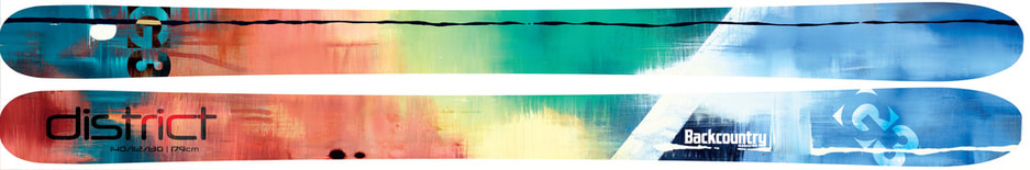
Fresh tracks in a foot of fresh powder is like the first stroke of paint on a blank canvas.
Abstract Terrain is a design I put together for G3 and Backcountry Magazine's topsheet contest. First I created an acrylic on canvas painting the full height and width of two skis using a variety of other mediums to produce interesting textures such as plaster, self-leveling gel and sand. After taking a high-res photo of the painting, I edited the image in Adobe Illulstrator, adding logos and text from G3 to create the final image for submission.
Inspired by the lines, textures and colours of skiing in the mountains, this Abstract Terrain celebrates the paintings we create with our skis as the brush and the snow as our canvas.
PRIOR SKI TOPSHEET DESIGN CONTEST - "RAVEN STEALS THE SUN"
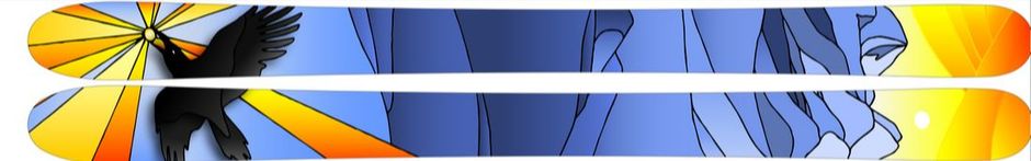
Raven Steals the Sun is a classic Northwest Coast First Nations legend that describes how Raven created the sun and stars at a time when the earth was covered in complete darkness. My topsheet design combines this with another Northwest Coast tale of the Two Sisters (aka "the Lions" - two almost identical peaks near Vancouver). The story of the Two Sisters celebrates the Chief's daughters who brought peace to the war-torn region.
The Raven and Two Sisters represent treasures we look for deep in the mountains: peace and enlightenment.
A Skier's Prayer
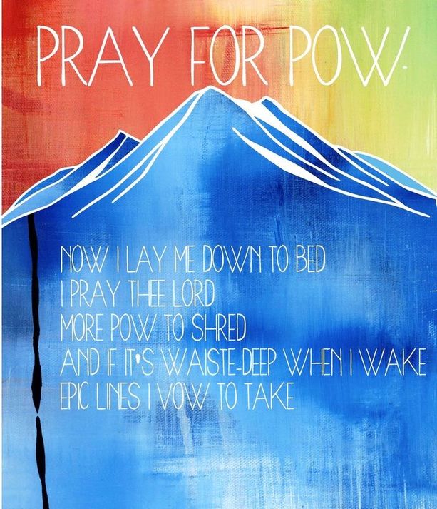
Ullr the Norse Snow God has blessed us with such a great 2015-16 season here on the west coast. Say your prayers each night so he will bring us fresh powder!